+++*

Symbolic Forest

A homage to loading screens.

Blog : Post Category : Geekery : Page 12

New World

In which we jumble the letters up

K was digging through her boxes of zines last night, hunting for something, and came across one she thought I’d find interesting. She passed it over. It was The Dvorak Zine – “changing the world, one keyboard at a time”.

I’ve heard of the Dvorak keyboard before. It’s a keyboard layout specifically designed to make typing quicker, and easier to learn. I’d never bothered, though, to investigate it, and find out what the layout actually is. The zine, though, is cunningly designed. The back page is a keyboard map; you prop it up on your desk and start typing away.

I’m not a proper typist. I’ve never learned to touch-type. My typing is pretty fast for someone who can’t type; but really it’s nothing more than very fast two-finger typing. As a result, it’s riddled with mistakes, and I spend more time going back and correcting what I’ve done than it takes to type the words in the first place. The Dvorak keyboard, though, seems specifically designed for touch-typing – and, looking at keys that type different letters to the letters printed on them would just be far too confusing for me. So, I thought: an ideal opportunity. Why don’t I learn?

So, this morning, I set the zine up on my desk, and switched the keyboard mode over. Put my fingers on the home keys, and started typing: one letter at a time.

It was slow, of course it was. But, as promised, it was surprising how quick it was to pick up. Within a couple of hours, it was quicker to type without looking at the keyboard map than to use it. This might actually work.

To be honest: I haven’t used it to type this. I did want to get something productive done today, so after 3 hours or so of Dvorak typing I switched back to the traditional layout. I don’t want to lose my ability to type the old way, after all: we don’t have a Dvorak typewriter and we’re unlikely to find one. I’m very pleased with how quickly I’ve been able to pick Dvorak up, though. What mostly slows me down is: like most people, I think in terms of words rather than letters. I seem to mostly type using my muscle memory of whole words and word fragments. Switching to Dvorak, I can easily remember where all the common letters are and which finger to use for them: but then I have to spell each word out in my head to type it. Training myself to type in words, without thinking about the spelling, will take some time.

The size of things

In which we measure monitors

The redesign is now almost done, which means that soon you’ll be saved from more posts on the minutiae of my redesign. It’s got me thinking, though: to what extent do I need to think about readers’ technology?

When this blog first started, I didn’t really worry about making it accessible to all,* or about making sure that the display was resolution-independent. It worked for me, which was enough. Over time, screens have become bigger; and, more importantly, more configurable, so I’ve worried less and less about it. When it came to do a redesign, though, I started to wonder. What browsers do my readers actually used.

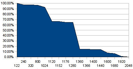
Just after Christmas, for entirely different reasons, I signed up for Google Analytics, rather than do my own statistics-counting as I had been doing. Because Google Analytics relies on JavaScript to do its dirty work, it gives me rather more information about such things than the old log-based system did. So, last week, I spent an hour or so with my Analytics results and a spreadsheet. Here’s the graph I came up with:

Browser horizontal resolutions, cumulative %

The X-axis there is the horizontal width of everyone’s screens, in order but not to scale; the Y-axis is the cumulative percentage of visits.** In other words, the percentage figure for a given width tells you the proportion of visits from people whose screen was that size, or wider.

Straight away, really, I got the answer I wanted. 93% of visits are to this site are from people whose screens are 1024 pixels wide, or more. It’s 95% if I take out the phone-based browsers at the very low end, because I suspect most of that is accounted for by K reading it on the bus on her way home from work. The next step up, though, the graph plunges to only 2/3 of visits. 1024 pixels is the smallest screen width that my visitors use heavily.

Admittedly there’s a bit of self-selection in there, based on the current design; it looks horrible at 800 pixels, and nearly everyone still using an 800×600 screen has only visited once in the two-month sample period. However, that applies to most of the people who visit this site in any case; just more so for the 800-pixel users. Something like 70% of visits are from people who have probably only visited once in the past couple of months; so it’s fair to assume that my results aren’t too heavily skewed by the usability of the current design. It will be interesting to see how much things change.

I’m testing the new design in the still-popular 1024×768 resolution, to make sure everything will still work. I’ll probably test it out a fair bit on K’s phone, too. But, this is a personal site. If you don’t read it, it’s not vital, to you or to me. If I don’t test it on 800×600 browsers, the world won’t end. The statistics, though, have shown me where exactly a cutoff point might be worthwhile.

* For example, in the code of the old design, all that sidebar stuff over on the right comes in the code before this bit with the content, which does (I assume) make it a bit of a bugger for blind readers. That, at least, will be sorted out in the new design.

** “visits” is of course a bit of a nebulous term, but that is a rant for another day.

Books I Haven’t Read (I’ve lost count which part)

In which we compare two David Crystal books with the inside of my head

Yesterday’s post, about how we can’t stop ourselves buying books, segues quite nicely into today’s. We didn’t just buy books on Saturday; we bought more on Sunday, from the weekend bookstall outside the Watershed that I remember mentioning not that long ago. I picked up a copy of By Hook Or By Crook by David Crystal; and then, thought to myself, should I really be buying a David Crystal book when I already have a book of his on the shelves that I haven’t yet read? I didn’t pause for long, because “you’ve already got one by him” is hardly a very good reason for not buying a book, but it’s true that the one Crystal book already on our shelves is one that I’ve never been able to get very far with. It is: The Stories Of English.

I find the language fascinating: both in use and in history. It’s such a playful thing, can be twisted and swerved, can be squeezed and stretched, and can be bent into truly awful puns. I love playing with it, I love its richness and I love its history, its constantly fluctuating and mercurial history. And so, I thought – rightly – that The Stories Of English would be an extremely interesting book. Crystal, moreover, is a very engaging and lighthearted writer. He’s very easy to read, very interesting, and clearly knows what he’s writing about very thoroughly.

So why, then, is it that I’ve never managed to get past the Middle English chapters? I’ve tried to read it several times, I’ve always enjoyed the sections I have read immensely, but I’ve never been able to get through Middle English. Every time, my enthusiam’s petered out somewhere in the fourteenth century, I’ve not come back to the book, and its later chapters have remained untouched. And so – given the number of times I’ve made an effort to read it – it definitely counts as a Book I Haven’t Read, even though it’s actually very good.

There’s one thing, only one thing, I can put my finger on. It’s quite a non-linear book. There are excurses and diversions. There are lots of box-outs. This is understandable. All histories can be highly non-linear, and The Stories Of English is deliberately written in a non-linear way, to take account of the parallel histories of different dialects of the language. I’m used to reading non-linear texts, or in a non-linear manner when I’m online and going down a Wikipedia hole, or when I’m researching something: flipping between tabs in my web browser, or shuffling through several open books on my desk, comparing pages and stopping to take notes. Only the other week, for example, I was sitting in the city reference library comparing passages in several books of railway history and taking notes on the development of Great Western Railway Wagon handbrakes. When I sit down to read a book for pleasure, by contrast, I’m not used to doing that. I expect my books to have a beginning, middle and end; a linear structure if not a linear narrative; flipping back and forth, both physically and mentally, needs more concentration. Crystal’s straightforward writing style, in this context, is deceptively easy to read. Especially when you reach the Middle English period, and the stories of English really start to get complex, purely because the amount of evidence available on the history of the language becomes much, much more comprehensive, it needs a lot more mental effort to keep track of things than you might think you’d need when you open the book.

By Hook Or By Crook, by contrast, is structured in a linear way, but one that’s orthagonal to its linguistics. It’s a road-trip book, essentially, with Crystal musing on anything of linguistic interest – or of any interest to him at all – which he comes across on the way. And it’s ideal for me to read, particularly because that’s the way my own brain works. Like him, I’m exactly the sort of person who would do an emergency stop and jump out of my car to photograph a misspelled sign at a level crossing. I’m racing through it, and I’ll probably have read it by the weekend; and I’ll probably read it again and again over the years. Its mode of writing complements my own favourite mode of reading, and my own favourite mode of thinking. It must also help that I know some of the places he writes about: for example, when I first opened the book at a random page I saw a photo of the Boston Lodge toll house apparently taken from a passing train.

The Stories Of English, by comparison, is something I have to concentrate on to get my head around. That, I suspect, is why it’s a Book I Haven’t Read. Yet.

Photo post of the week

In which I spot a train

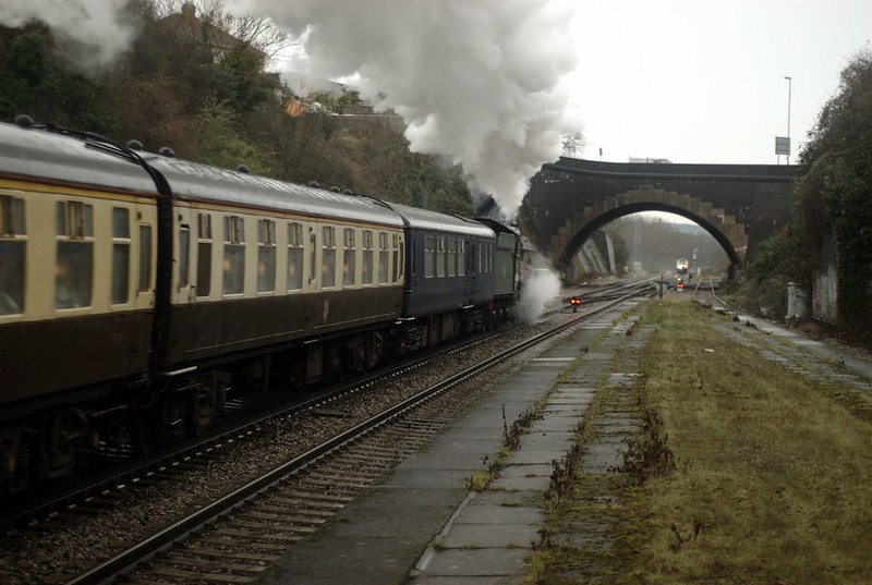
We discovered, the other week, that occasionally, just sometimes, if you drag yourself out of bed early on a Saturday morning and get down to our local railway station (1 train an hour if you’re lucky, to Weston-super-Mare), you can see something a bit more interesting than normal…

The Torbay Express passing Parson St station

The Torbay Express passing Parson St station

Two Torbay Expresses passing Parson St station

Two Torbay Expresses passing Parson St station

If one of the trains had been travelling a few seconds later or earlier, I’d have got a great photo of the equivalent 1930s and 1970s express engines passing each other.* As it was, the modern train is a blob in the distance. Ah well. Maybe I’ll get up early tomorrow too.

* With the added, slightly confusing detail, that both of the trains involved (not the engines) have the same name.

Hardware

In which my disbelief loses some of its suspension

Just recently, we’ve been spending a lot of time sat indoors in front of the telly, watching season one of *The Wire*, which a friend was kind enough to buy us on DVD, saying: “it’s the sort of thing you’ll like”. And, indeed, it’s very good. I’m not normally a fan of police dramas; but The Wire is good enough to stand as a drama on its own without the “police procedural” aspect of the show.

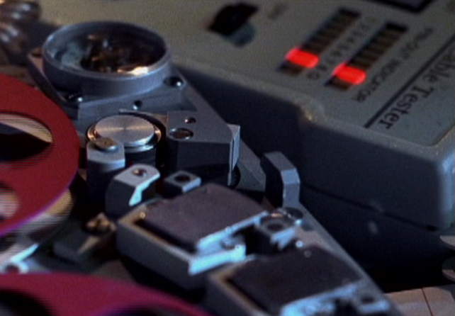
One little tiny thing, though, made me think: bah. One little detail they slipped up on: right at the start, in the opening credits. It’s the curse of knowing too much about anything, being able to spot the detail mistakes in any sort of fiction. The Wire is so named, at least in part, because a lot of the police’s evidence comes from phone tapping;* the credits features closeups of surveillance equipment,** phone-tap gear, spectroscopic voice analysis screenshots, and so on. Including this gadget:

Screen capture from The Wire's opening credits

That thing at top right. It’s got lots of nice blinky LEDs – you can’t see on a still, obviously, but the lights move in a regular step. Problem is, I know, from work, exactly what that is. Lots of computer geeks will. It’s a cable tester – you can just about make out the words on it – for 4-pair cable, the sort used mostly for Ethernet.*** I keep one in my toolkit, with the cable crimps, because it’s invaluable to check if you’ve crimped a good joint. It’s also absolutely no use for tapping a public phone. Ah well. Just that one little mistake by a set dresser, and it disappointed me a little.

* Hopefully that isn’t giving too much away there.

** One thing that puzzled us: if it’s set in this decade, why do all the cops use 1970s-era Nikon cameras for surveillance, and not the equivalent digitals? Or, for that matter, why are they forced to write up reports on Smith-Coronas?

*** Or, to be fair, for some office phone systems. It’s also worth pointing out that although it’s used for Ethernet cable it doesn’t prove a cable is any good to use for for Ethernet – it’s easy to make a cable that will pass this electrical test but not work as a network cable.

Footnote

In which we debate a design detail

Regular readers might have noticed that yesterday’s post was a bit of an experiment. In case you didn’t spot what the experiment involved, here’s a clue:

Screenshot

Ever since it started, this blog has gone in for copious footnotes, on just about every post,* flagged up with stars in the usual way. One thing I’ve never been entirely happy with, though, is that the more footnotes you have, the more stars each note requires. A fifth or sixth footnote starts to get unwieldy, as some previous posts have demonstrated. So I’ve been idly thinking about other ways to indicate a footnote: symbols, numbers, or something else.

You can tell I’ve been idly thinking about it, because it’s taken me over three years to try an experiment with using numbers instead. I’m not really sure, though, whether I like it or not. K, I know, definitely doesn’t like the new numbered style; she was almost tempted to leave a comment saying “Bring back the stars!” so she must care. Or I could try out a series of different symbols, instead of a line of stars. More experimentation might be called for.

* When I first started drafting this post, it didn’t have any. “Oh, the irony”, I thought to myself, “of having no footnotes on a post about footnotes.” Fortunately, one soon came to me.

Searching

In which someone admits that SEOs are entirely pointless

An intriguing claim appeared in The Guardian yesterday, buried in its corrections column. Insurance-comparing website GoCompare has stated that there is little connection between its Google positioning and its income. More specifically: dropping from the first page of Google results for a common search term did result in a big drop in traffic, but had no financial effect on the company.

GoCompare is an internet business. As far as I understand it, they rely entirely on their website for income. What they’re claiming is: when Google lowered their ranking, they lost a large amount of traffic – but that none of that traffic, apparently, was making them any money.*

There are entire companies based solely around the premise that they will push you up to the top of Google’s pages. I’ve known marketers spend huge amounts of time and effort on it, taking common search phrases and analyzing them with a fine-tooth comb, trying to find out why they’re below their competition. I’d expect GoCompare to have been doing exactly the same thing themselves, in fact. And they’ve found, apparently, that it was all for nothing – because when Google pulled the rug from under their efforts,** they say, it had no effect at all on their income. Maybe they’re a special case because (unlike smaller online companies) they do spend a lot on irritating minimal-budget TV adverts.*** Even so, it’s intriguing. If their claim is true, there’s probably hardly any point at all in any large organisations spending much effort on search-engine optimisation. Small companies who can’t afford TV adverts, or who produce specialist products – well, that probably doesn’t apply. It probably doesn’t apply to AdWords campaigns either. But general search results? “Overall sales figures were not affected”.

* They seem to be talking about general search results. If they were talking about paid-for adverts, then the drop in traffic would also mean a drop in outgoings; but as they’re not, the change in traffic shouldn’t have any effect on their running costs.

** The Guardian had previously speculated that Google did this deliberately – it was that article which prompted the correction.

*** which, at least, aren’t as annoying as those produced by their competitor Confused.com. I’m never going to go near confused.com, no less than barge-pole distance, because their adverts are that bad. “I’m so stupid I’m trying to get money from a piece of cardboard with a cartoon cash machine printed on it! I’m confused! Dot com!”

Predicting the future

In which we worry about the weather

It’s a hard thing to do.

The other week, as there’s a long weekend coming up, I booked a camping holiday, in Wales. Only a day or two later, the news outlets started running stories about how awful the Easter weekend weather was going to be; wind, rain, sleet and snow. Oh dear.

There’s still snow on the forecast for Northumbria; but the forecast for the Welsh weather, though, has got noticeably better over the past few days. It’s gone from sleet, to showers, to sunny periods. And I’ve noticed this happening before. There seems to be a tendency now for the forecasts to be more extreme further off, before calming down as the date approaches.

Which is statistically what you’d expect, of course. Extreme weather is, by definition, unlikely, and shorter-range forecasts are always more accurate, so any extreme weather in a long-range forecast is likely to mellow as the forecast gets closer. That doesn’t stop the news jumping on any forecasts of horrible blizzards, though. I’m still worried that the snow forecast for the north Pennines is going to creep southwards over the weekend.

Joke of the week (part two)

In which a classic joke has a happy ending

“My dog’s got no nose.”

“Haven’t we been through this?”

“Shush. My dog’s got no nose.”

“How does he smell?”

Well, funny you should ask that. We’ve just joined this scheme called Smelling-Nose Dogs. You know how, in America, guide dogs are called seeing-eye dogs? My dog with no nose now has his own guide dog, who goes around, sniffs things, guides him away from odorous obstacles and generally lets him in on all the latest dog-gossip.* And it’s given him a whole new lease of life! He’s happy, and bouncy, and has a shiny coat!** He’s always bounding around and eager for his smelling-nose dog and him to go for a walk together. Completely unlike how he used to be, always moping in his basket unable to smell anything.”

“That’s nice.”

“Yes, it’s really done him the world of good.”

“Still not very funny, though.”

“Er, no.”

* You know – which dogs have urinated on which lamp-posts and that sort of thing. Which is, I’m told, very important information for dogs.

** Not that that has much to do with anything. Maybe I should be a copywriter for Evil Nestlé’s dog-food arm.