On the map
Or, a curious Ordnance Survey oddity
If you follow me on Twitter, you might have noticed the other day I posted an intriguing extract from an Ordnance Survey map I’d never noticed before: a railway station that has a long, peculiar siding shown on a particular revision of the One Inch map, that isn’t shown on other revisions of the same map; that isn’t shown on other contemporary Ordnance Survey maps of different scales, and that isn’t mentioned in any books I’ve seen that cover the railway line in question. Now, this isn’t a post about that particular map, and part of the reason is that the OS spotted my tweet, and suggested I investigate the OS-related holdings in the National Archives, as they may contain notes that answer the question. There’s also another lead I want to chase up, which might contain more information, and I didn’t really want to write half a post.
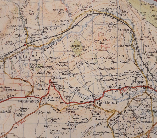
However, it did remind me of another smaller Ordnance Survey curiosity that has intrigued me for years, even though it’s not that much of a mystery. Back in the 1970s, my dad wanted to walk the length of the Pennine Way; and as part of his planning, he bought a number of guidebooks and a copy of every Landranger sheet that covered the route. It’s quite a stack of maps to take along with you, even at Landranger scale, so I’m not sure how easily he would have packed them all; however, as he never did the walk, he never faced that particular challenge. The walk—if you do it in the usual direction from Derbyshire to Scotland—starts here, on Sheet 110.

There’s Edale and there’s the start of the Pennine Way; its original route up onto Kinder Scout, not the current one. There’s Mam Tor, before the road across its flanks was permanently closed, and the railway line past Hope and Earles Sidings. Look what’s odd, though. The typefaces roughly North of Edale and roughly South of Edale are different. The north (and most of this sheet, and every other sheet of this vintage) uses a set of sans typefaces; the south uses a serif typeface.
I remember poring over all of my dad’s Pennine Way maps as a kid, and being intrigued by the sudden switch in font, which applies to a strip of land all across the bottom of this map. To be honest, though, it’s fairly easy to explain. I said earlier that this is a Landranger map; but when it was published, that name hadn’t been invented. At the time these were the “1:50,000 First Series” maps, published and prepared in double-quick time in the first half of the 1970s to keep pace with the project (never quite completed) to switch the UK over to metric measurements. The First Series were produced by taking the previous generation of One Inch maps and photographically enlarging them, to expand them from 1:63,360 scale to 1:50,000. They then had changes applied to bring major features, motorways and such, up to date. As they were published in 1974, all the county boundaries were replaced with the newly tidied up and rationalised ones. Presumably sheets covering South-East Wales had the national boundary moved from Cardiff to Chepstow, and the note about the disputed status of Monmouthshire removed from the key.
All the First Series map covers included a paragraph of information about the process, and a little diagram in the key explaining how old the maps used to make each sheet were. Here’s the diagram for Sheet 110; the wonkiness is from me holding it up to the camera badly.

That strip along the bottom, revised 1960? That’s the part of the map that uses different fonts to the rest. Intriguingly, though, the major part of the map is from an older revision, albeit only a couple of years older. I wonder why this particular One Inch sheet with the older set of typefaces crept through to the First Series of metric maps, and why it wasn’t made consistent with the rest.
Incidentally, it’s only the First Series that were produced by enlarging the One Inch maps. The 1:50,000 Second Series were drawn from scratch, with their own new typeface, and with new, metric contours at 10m intervals. The First Series still had the 50ft contours of the One Inch maps, but relabelled to the nearest metre, giving you odd contour line measurements such as 76m and 427m.
Maybe one day I will solve the other map puzzle, search through the records at Kew, find out the answer to my railway siding puzzle and post the answer to that here too. We live in hope. As, indeed, do the people in the bottom-right corner of that map extract.

 Home
Home