Cartography
In which we wish for better maps
Maps are wonderful, lovely artefacts. I love to spread one out and read it like a book, analysing every square. Nowadays, though, I only do it for pleasure. Because, for practical reasons, if I want to plan a route or look somewhere up, it’s usually much much easier to go online for it.
There are downsides to this. Google Maps are nowhere near as good as a paper map. Their cartography just isn’t up to the same standard. They include roads, railways, rivers, and that’s about all. No buildings, no landmarks, no landscape. In Britain, Google Maps have the slightly odd habit of only including railway lines with passenger services,* and there seems to be no contours and few footpaths.
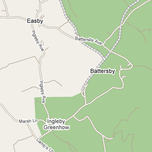
Google, though, are nowhere near as low-quality as Yahoo Maps. Since I bought a full Flickr account, I’ve used Yahoo Maps a lot, to record where I take my photos; and there are just so many places where Yahoo’s map doesn’t match reality. Take, for example, somewhere I visited recently with my camera: Battersby, on the edge of the North York Moors national park. This is Google:

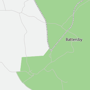
For comparison, this is the Yahoo version at the same scale:

Never mind the lack of street names, and the general lack of contrast which makes it difficult to see where the roads run, especially within the National Park. Where exactly does that railway run? Where is the park boundary? The park boundary does indeed follow the line of the railway; but what shape is it? There’s a big difference there, just because Yahoo’s maps don’t include enough detail, apart from for roads, to be at all accurate when zoomed in. Rivers are just as bad, and apparently have zero width too.
If you really wanted to know the answer to the park boundary question, incidentally: it’s Google that’s right, as you can see by looking at Streetmap, who license the Ordnance Survey’s maps. Now that’s what a map is supposed to look like.
* It probably derives from the Ordnance Survey’s long-standing division between “railways” and “freight lines, sidings or tramways”, which dates right back to the start of the One-Inch series. It was bad enough when Landrangers, at I think the Second Edition, dropped the distinction between single-track and multiple-track railways. I have some First and Second Edition Landrangers somewhere, so I’ll have to check when the single-track railway symbol disappeared. First Edition were the last One-Inch maps photographically enlarged, which leads to some odd discrepancies on them;** the Second Edition were redrawn.
** for example, on the First Edition Sheffield and Huddersfield Landranger map (sheet 110), a chunk towards the south of the map is lettered in a different, older, font, which suggests that part of the map was derived from a rather earlier original than the rest of the series. I’ll scan a section some time to show you.
Update, August 30th 2020: At some point in the last 10 years, Google Maps’ coverage of railways became much better, not only including non-passenger railways, but detailing the coverage down to individual tracks, not just lines of route. So hurrah, on that point at least!
Update, October 19th 2020: Some twelve years later, I have finally got around to writing the blog post I promised in the second footnote.

 Home
Home