The size of things
In which we measure monitors
The redesign is now almost done, which means that soon you’ll be saved from more posts on the minutiae of my redesign. It’s got me thinking, though: to what extent do I need to think about readers’ technology?
When this blog first started, I didn’t really worry about making it accessible to all,* or about making sure that the display was resolution-independent. It worked for me, which was enough. Over time, screens have become bigger; and, more importantly, more configurable, so I’ve worried less and less about it. When it came to do a redesign, though, I started to wonder. What browsers do my readers actually used.
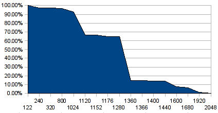
Just after Christmas, for entirely different reasons, I signed up for Google Analytics, rather than do my own statistics-counting as I had been doing. Because Google Analytics relies on JavaScript to do its dirty work, it gives me rather more information about such things than the old log-based system did. So, last week, I spent an hour or so with my Analytics results and a spreadsheet. Here’s the graph I came up with:

The X-axis there is the horizontal width of everyone’s screens, in order but not to scale; the Y-axis is the cumulative percentage of visits.** In other words, the percentage figure for a given width tells you the proportion of visits from people whose screen was that size, or wider.
Straight away, really, I got the answer I wanted. 93% of visits are to this site are from people whose screens are 1024 pixels wide, or more. It’s 95% if I take out the phone-based browsers at the very low end, because I suspect most of that is accounted for by K reading it on the bus on her way home from work. The next step up, though, the graph plunges to only 2/3 of visits. 1024 pixels is the smallest screen width that my visitors use heavily.
Admittedly there’s a bit of self-selection in there, based on the current design; it looks horrible at 800 pixels, and nearly everyone still using an 800×600 screen has only visited once in the two-month sample period. However, that applies to most of the people who visit this site in any case; just more so for the 800-pixel users. Something like 70% of visits are from people who have probably only visited once in the past couple of months; so it’s fair to assume that my results aren’t too heavily skewed by the usability of the current design. It will be interesting to see how much things change.
I’m testing the new design in the still-popular 1024×768 resolution, to make sure everything will still work. I’ll probably test it out a fair bit on K’s phone, too. But, this is a personal site. If you don’t read it, it’s not vital, to you or to me. If I don’t test it on 800×600 browsers, the world won’t end. The statistics, though, have shown me where exactly a cutoff point might be worthwhile.
* For example, in the code of the old design, all that sidebar stuff over on the right comes in the code before this bit with the content, which does (I assume) make it a bit of a bugger for blind readers. That, at least, will be sorted out in the new design.
** “visits” is of course a bit of a nebulous term, but that is a rant for another day.

 Home
Home